Banking that explains itself
A ground-up redesign of a mobile banking app for people who have never trusted one.
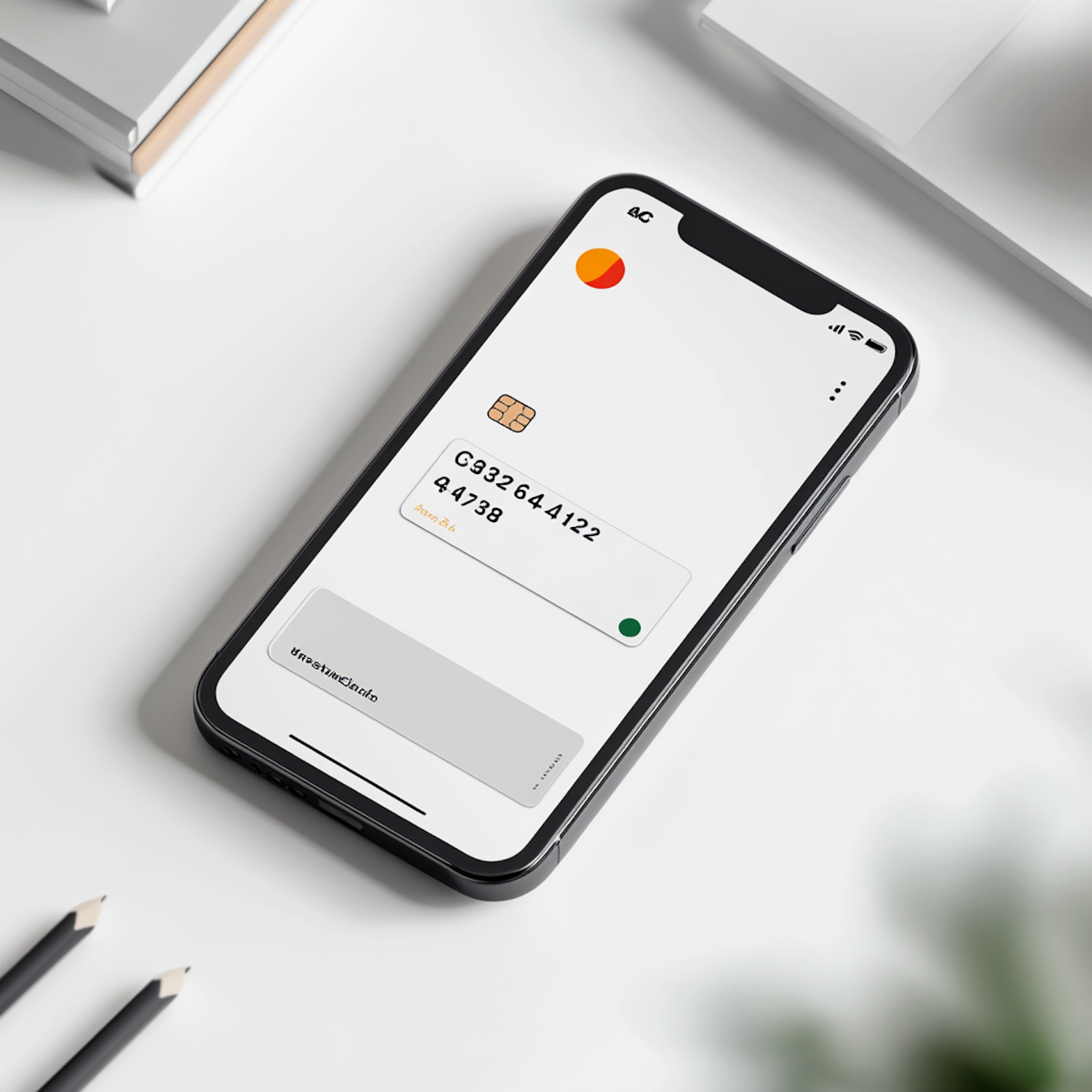
- Client
- Atlas
- Year
- 2025
- Timeline
- Fourteen weeks
- Discipline
- Product Design
Overview
Atlas launched with strong engineering and a confusing product. People opened accounts, moved money once, and never came back. I was brought in to find out why, and to rebuild the core experience around the moments that actually decide whether someone stays.
The problem
Onboarding took eleven screens and asked for information the bank did not need yet. Once inside, the home screen showed a balance and little else, so nobody understood where their money went. Support tickets were dominated by two questions: why did this transaction cost more than I expected, and when will my transfer arrive?
What I did
- 01
Sat in on thirty support calls and interviewed nineteen customers who had gone quiet after their first month.
- 02
Cut onboarding from eleven screens to four by deferring every field that was not legally required at signup.
- 03
Rebuilt the home screen around a plain-language activity feed, where every entry states the fee and the arrival time before you tap.
- 04
Shipped a 60-component design system so the team could keep the new patterns consistent without me.


Outcome
The new experience went live across iOS and Android in March. Activation climbed within the first six weeks, and the two most common support tickets dropped off the top-ten list entirely.
- Onboarding screens, down from 11
- 4
- Signup-to-first-transfer completion
- +38%
- Fee-related support tickets
- −52%
- Components in the shipped system
- 60
Elena rewrote how we think about our own product. She arrived with questions rather than opinions, and the answers reshaped our roadmap for the year.